Hana Baby Rebrand: What’s Changing & Why It Matters
Over the past few months and still to come over the next few.... You will start to see a few changes around here. No big loud changes, but small details that are evolving and slowly giving our brand and products a more aligned feel with this new owner.
Taking over from Melissa meant more than just a title change, it was a chance to breathe new life into our brand. Our journey through the branding process with Amanda from Wild Birch Studio was a creative adventure. You'll learn how our brand redesign reflects our company mission and paves the way for a fresh visual identity.
Curious about the changes you'll soon see, from packaging redesign to logo updates? Let's dive into what this business rebranding means for you and our trusted babywearing brand.

Taking our inspiration from the natural world
Inspiration Behind the Redesign
Our brand redesign began with a deep look at what truly matters to us as a company. As the new owner of Hana Baby I had a legacy to continue, and a brand to uphold. I didn't want to rush into a redesign, instead I wanted it to unfurl as the buisness and I got equanted. I wanted to ensure that our visual identity aligns with our core values and mission.
Inspiration came in many forms. From nature and the sustainability of the brand, to parenting and play, and the gentleness we wanted to convey with our branding.
I've put together this blog to show how I've paid homage to our company mission and worked with Wild Birch Studio to bring our ideas to life.
Honoring Our Company Mission
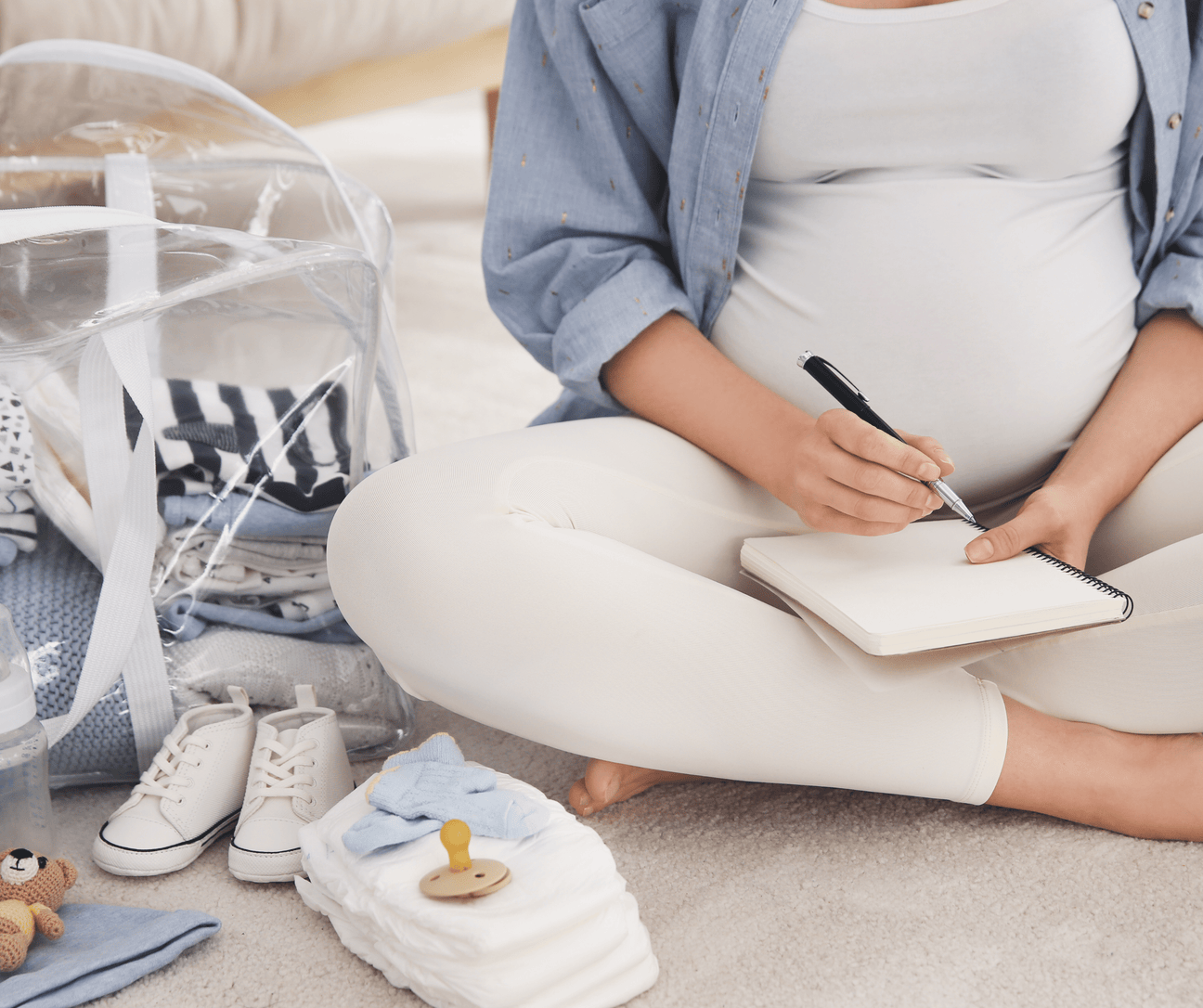
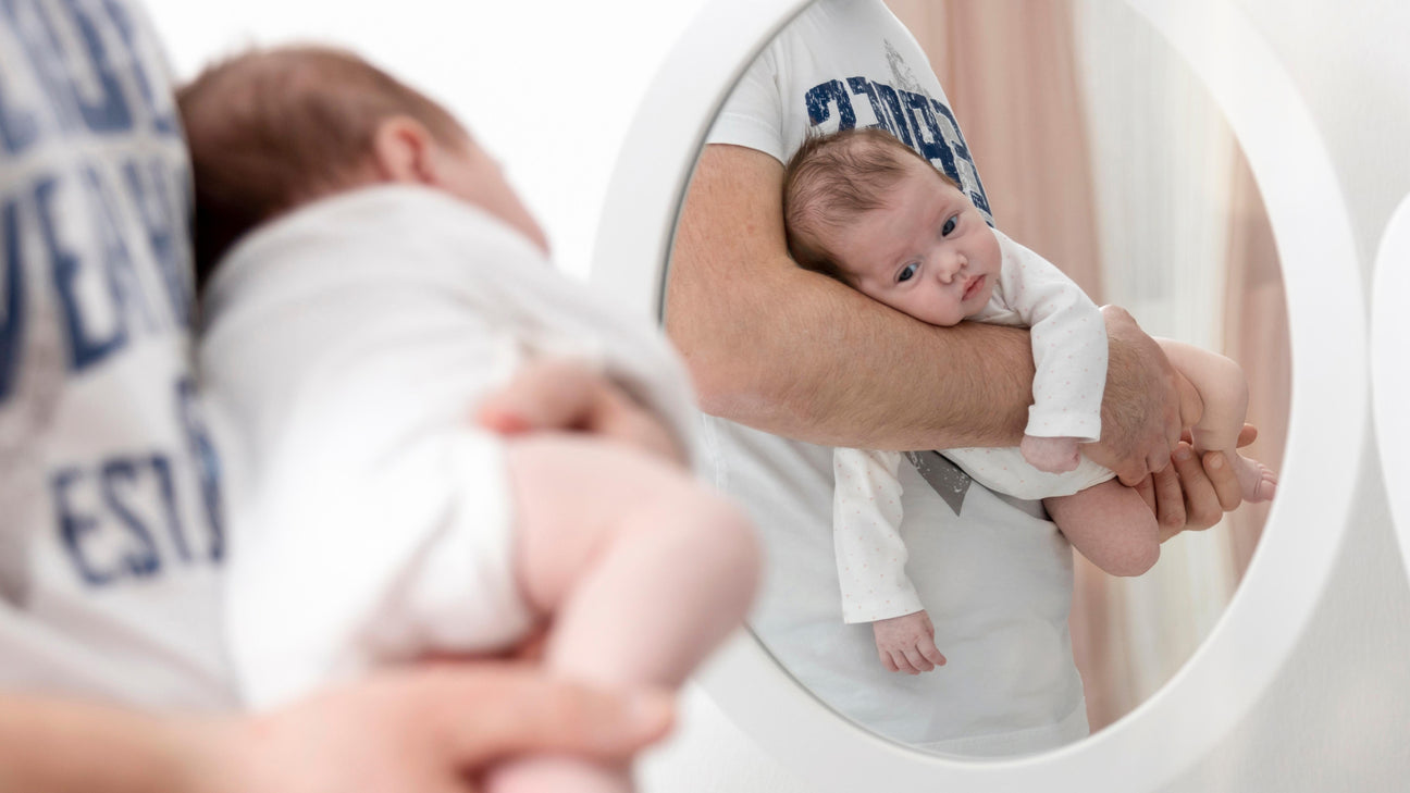
Our company mission is centered around fostering a strong bond between parents and their children through the art of babywearing. This mission guided every aspect of our brand redesign. We wanted to create a visual identity that reflects the warmth and comfort our products provide.
To honour this mission, we focused on designs that evoked feelings of love and connection. As well as having a nature based connections in the gentle colours and organic shapes. Our goal was to create branding that resonates with parents and caregivers, helping them feel confident in their choice to use our products. This redesign aims to remind our community that they are part of a trusted brand that values their parenting journey.
By prioritising our mission, we ensured that our new branding remains true to the essence of our company. This helps maintain the trust and credibility we have built over the years with our loyal customers and partners.
Collaborating with Wild Birch Studio
Collaborating with Amanda from Wild Birch Studio was a pivotal part of our brand redesign process. Her creative vision and understanding of our goals made her the perfect partner. Amanda's expertise helped us reimagine our brand while staying true to our core values.
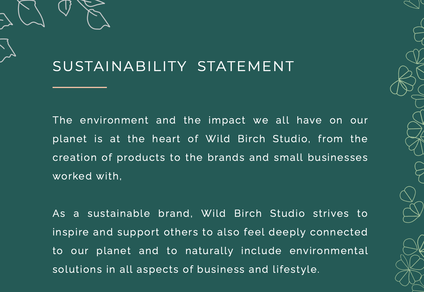
Sustainability Statement from Wild Birch Studio
Wild Birch Studio brought fresh ideas and perspectives, which enriched the redesign process. Together, we explored different design elements and concepts that would capture the essence of our babywearing brand. This partnership allowed us to push the boundaries of our traditional branding.
Working with Wild Birch Studio also brought new challenges and opportunities. Amanda guided us through overcoming design obstacles, ensuring our new visual identity was both unique and reflective of our mission. This collaboration was essential in achieving a cohesive and meaningful brand redesign.
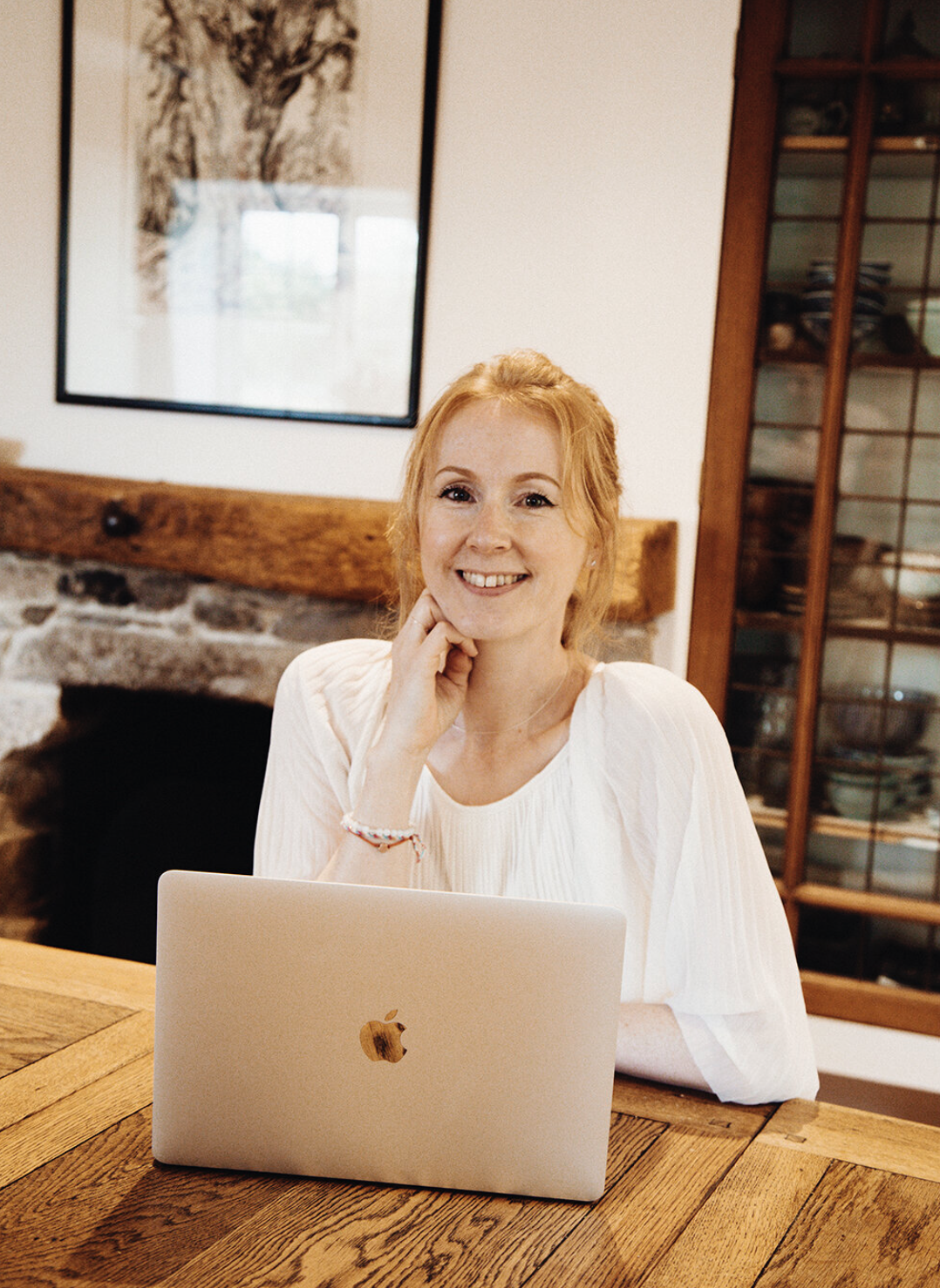
Amanda from Wild Birch Studio
Branding Process and Challenges
Refreshing our visual identity involved many steps and challenges. Here's the steps on how we explored refreshing our look and the obstacles we faced along the way.
Refreshing Our Visual Identity
Refreshing our visual identity was a crucial step in our branding process. We wanted to create a look that was both modern and reflective of our heritage. This meant re-evaluating every aspect of our design, from colors to fonts.
-
We began by analysing our current branding and identifying areas for improvement.
-
We brainstormed ideas that would align with our company mission and resonate with our audience.
-
We worked closely with Wild Birch Studio to explore new design elements, ensuring each choice was intentional and meaningful.
The refreshed visual identity aims to capture the essence of our brand while making it more relatable and appealing. This process was not just about making changes but about creating a lasting impact on our community.
Overcoming Design Obstacles
The road to our new branding was not without obstacles. One of the biggest challenges was balancing modern design with our brand's traditional elements. We wanted to innovate while preserving what our audience loves about us.
Working through these challenges required collaboration and creativity. Amanda from Wild Birch Studio played a crucial role in helping us navigate these complexities. Her approach to problem-solving ensured that we stayed true to our mission while embracing new ideas.
Another obstacle was ensuring consistency across all platforms and materials. We had to carefully align our new designs with existing products and marketing materials, which required meticulous planning and execution. This attention to detail helped us achieve a seamless transition to our new brand identity.
Our new logo
Changes to Expect
As we unveil our new brand, there are exciting changes you’ll notice. You will start to see our new packaging redesign and logo updates.
Packaging Redesign Insights
Our packaging redesign is one of the most visible changes you will see. We wanted our packaging to reflect the quality and care that goes into our babywearing products. This required thoughtful consideration of design elements that would resonate with our audience.
We focused on creating packaging that is not only visually appealing but also functional. We wanted to use less chemicals and have packaging that will be more easily recyclable. The new designs incorporates a more simple design of our packaging, but a stronger product that will withstand the postal process a little better.
I want you the receive the products through the post in the way they've been loving packaged at our warehouse, even if the postman gets a bit rough with them.
In addition to aesthetics, we considered the practical aspects of packaging. This includes easy-to-read instructions and eco-friendly materials. These changes ensure that our packaging supports our customers' needs while promoting sustainability.


New packaging sample
Logo Changes and Future Plans
Our logo is an integral part of our brand identity. While changes to the logo are small they are noticeably different, our new design reflects our commitment to growth and innovation. The updated logo maintains elements that our customers and partners recognise while introducing fresh design aspects.
The new logo features a more streamlined and modern look, symbolizing our evolution as a brand. This change is part of our broader effort to enhance our visual identity and ensure it resonates with new and existing customers.
Looking ahead, we plan to integrate the new logo across all products and platforms. This will ensure consistency and reinforce our brand message. These changes are designed to strengthen our connection with our community and support our mission of nurturing parent-child bonds.
This rebrand has been such a thoughtful and meaningful journey for me, and I hope as you start to notice these changes, you feel that same sense of care and intention behind them. I’d truly love to hear what you think, whether it’s your first impression of the new look or your experience with our products over the years.
Your feedback will always mean so much to me, and helps shape the future of Hana Baby, so please do share your thoughts with me.